
Dance Jam
UI/UX Project
Project Overview
Dancing is more than just movement—it’s a way to relieve stress, express freedom, and connect with others. It builds community among people who share a passion for dance. Yet, finding clear, organized information about dance studios and classes online can be frustrating and overwhelming.
Dance Jam is a platform that partners with thousands of dance studios worldwide, making it easy for dancers of all levels—whether beginners or professionals—to explore, book, and save classes seamlessly.
My Role
I led user research, competitive analysis, user flow creation, wireframing, prototyping, logo design, brand identity, and illustration. This case study was developed as part of my Springboard UI/UX Bootcamp.
Design Process
1.Empathize 2. Define 3. Ideate 4. Prototype 5. Test
Design Toolkit

Competitive Analysis
I conducted a competitive analysis of three workout apps that I identified as potential competitors to Dance Jam: ClassPass, MindBody, and Millennium Dance Complex. My research focused on three key usability principles: User Control and Freedom, Consistency and Standards, and Aesthetic and Minimalist Design.
By evaluating how each app applied (or overlooked) these principles, I was able to identify both effective strategies and common pain points. These insights directly informed my design decisions for Dance Jam, helping to shape a more intuitive and user-friendly mobile experience.

User Research
To better understand my target audience, I conducted a series of surveys and interviews with young to mid-aged adults (ages 20–35) who share a passion for dance. Participants ranged from seasoned dancers with over 10 years of experience to beginners just starting out.
After collecting the data, I created an affinity map to organize insights and identify common themes and patterns across responses. This process allowed me to uncover key user needs, behaviors, and pain points that informed the design direction.
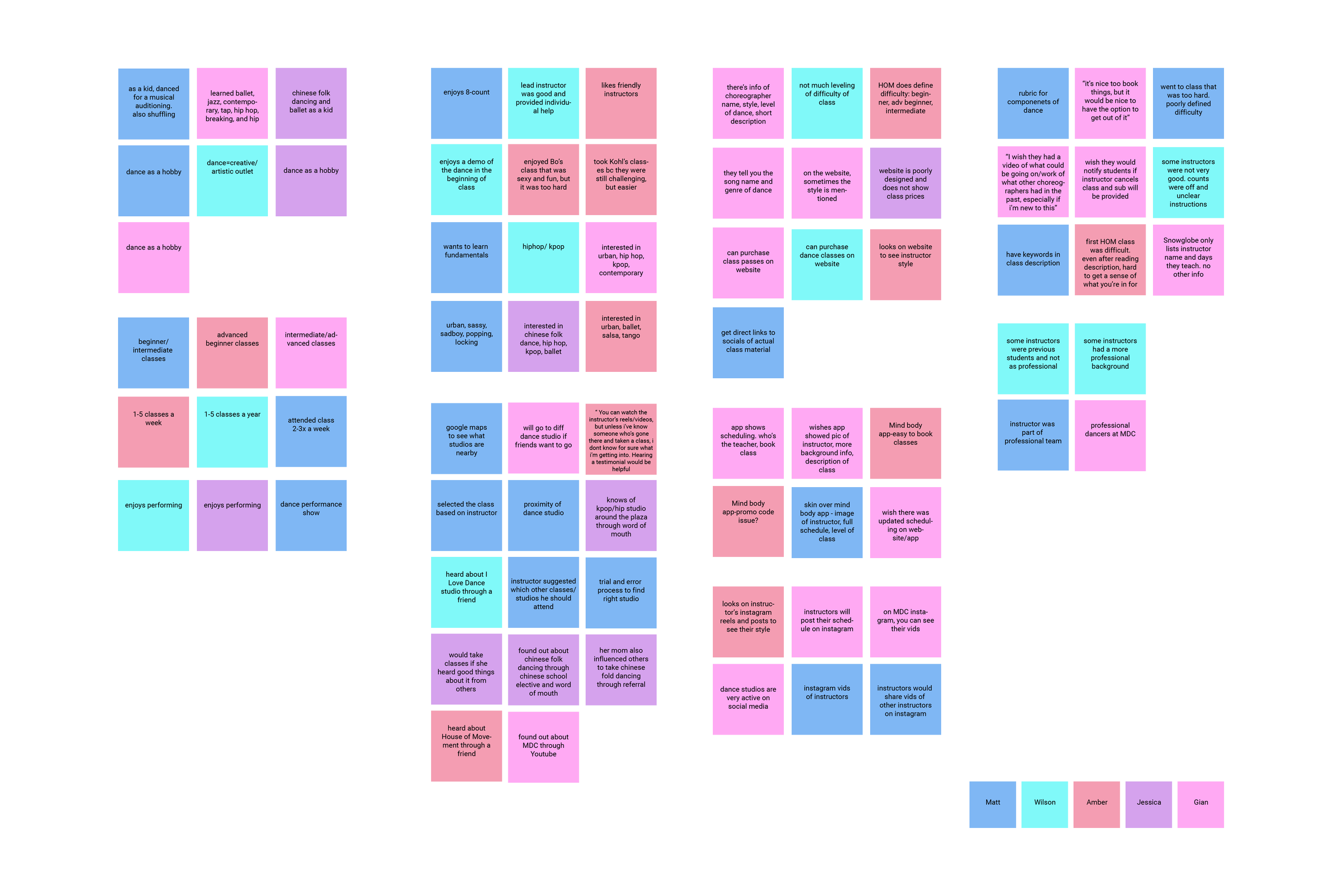
Insight Findings
Lack of Instructor Information
Users often only see the instructor's name with little to no background details. This makes it difficult to know what style or experience level to expect. Users want to feel prepared and informed before attending a class.Unclear Class Descriptions and Levels
Many users are unsure which class to choose due to vague descriptions and undefined skill levels. Without clear indicators, users risk attending classes that are too advanced or not aligned with their goals.Poorly Organized Website/Mobile Platforms
Users frequently encounter disorganized interfaces and limited functionality. In some cases, they can’t book classes directly and are redirected to third-party apps. Pricing information is also often missing or hard to find.Lack of Video Previews
Users expressed a desire for short video excerpts to better understand each instructor’s teaching style and choreography. Without this, it’s difficult to gauge the vibe or difficulty of a class.Limited Access to Reviews
Finding reviews for specific classes or studios is challenging. Users value diverse opinions to help them make informed decisions and feel more confident about trying a new class.
Empathy Map & User Persona
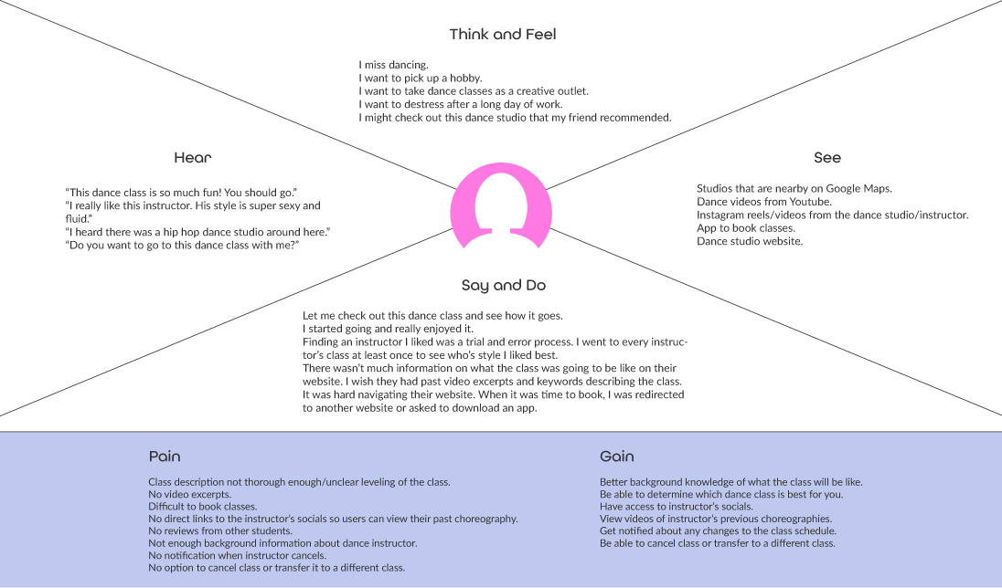
Using insights gathered from user research, I created an empathy map to better understand users’ thoughts, feelings, and behaviors. This helped me step into their shoes and identify their needs more clearly.
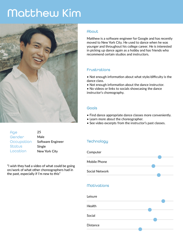
From this, I developed a detailed user persona, Matthew Kim—a passionate dancer seeking accessible and transparent information when booking classes. Throughout the design process, Matthew became a guiding reference. By designing with users like him in mind, I aimed to create a seamless and inspiring experience for anyone pursuing their love of dance.
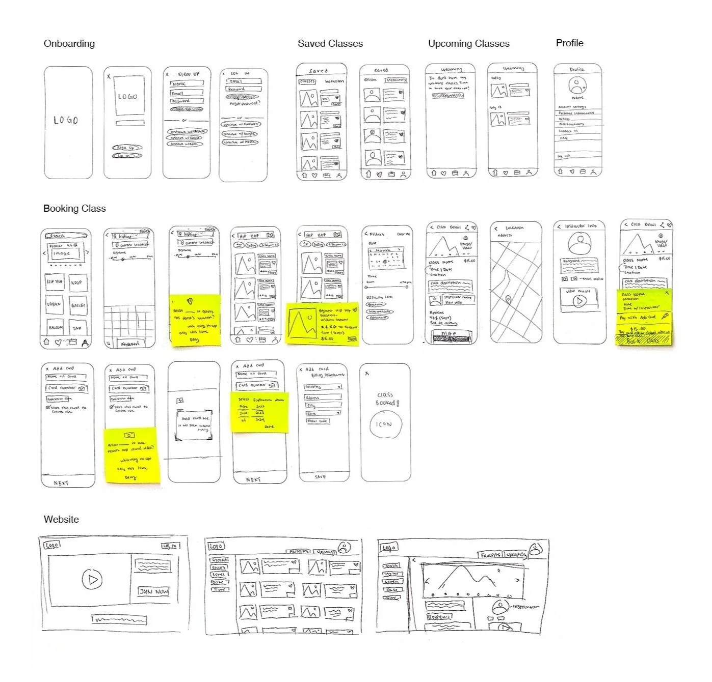
Sketches
With a clear focus on my users’ needs, I created rough sketches
to map out how they would navigate the Dance Jam app.

Low Fidelity Prototype
I created low-fidelity wireframes in Figma to synthesize the collected research and organize the content layout. Using a grayscale color scheme, I focused on structure and hierarchy to guide the foundation of the final product design.
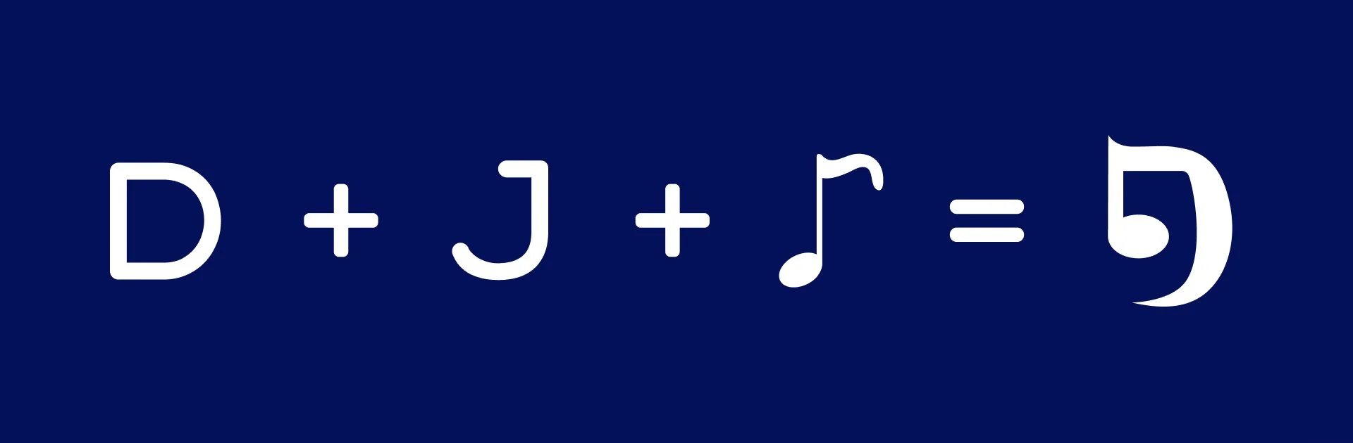
Logo Design
I set out to design a logo that was both instantly recognizable and reflective of the spirit behind “Dance Jam.”
Dance is all about syncing movement with rhythm, so I thought it would be a clever and meaningful touch to combine the letters “D” and “J” with a music note—capturing both the name and the energy of dance.

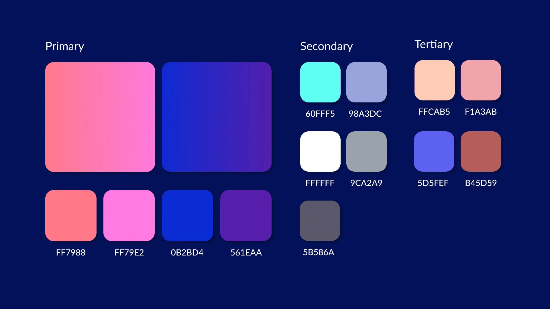
Color Palette
The color palette is designed to feel fun and inviting, inspired by the vibrant LED lighting often found in dance studios. The goal is to capture that energetic, playful atmosphere through color.

Typography & Iconography
Illustration
I chose illustrations with soft edges and playful shapes to reflect the brand’s inviting and cheerful personality.

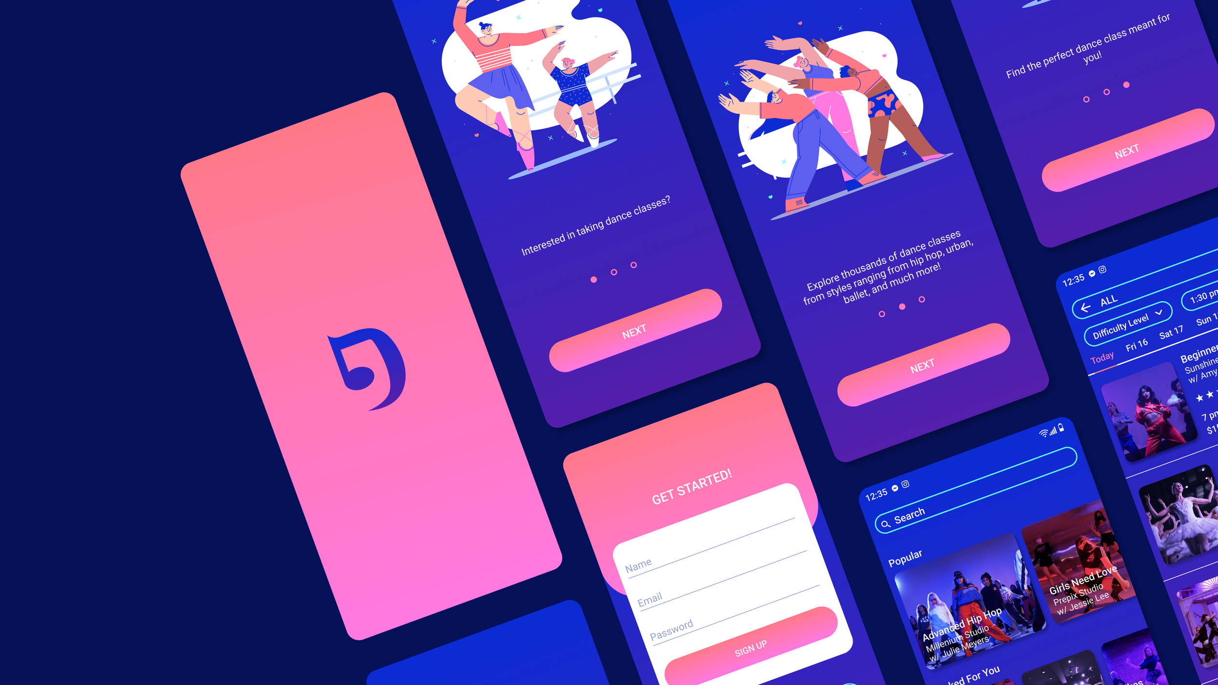
High Fidelity Prototype
I brought together all the elements developed throughout the design process to create an app that feels fun, approachable, and intuitive.


Key Feature 2
The class name, dance studio, and instructor are clearly displayed alongside the class time and duration. I designed a simple and intuitive process for adding a payment method and booking classes seamlessly.
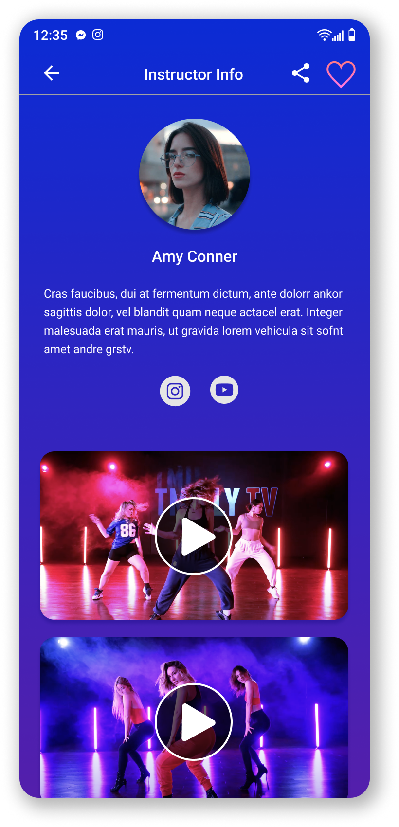
Key Feature 3
Users can explore each instructor’s profile to gain deeper insight into their dance style and experience. Profiles also feature past choreography videos and links to follow instructors on social media.
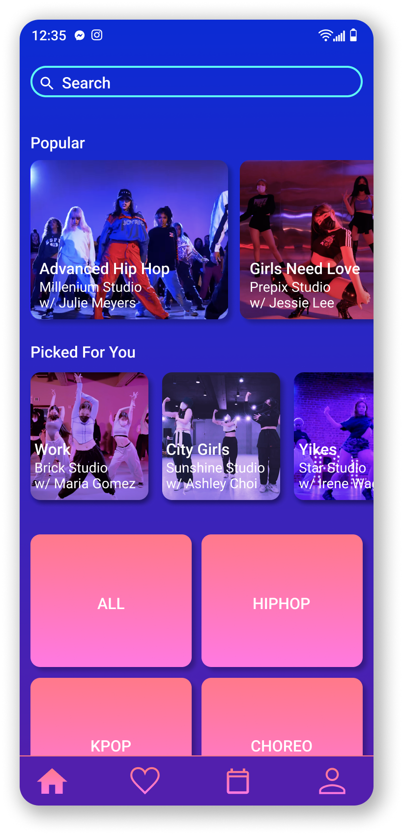
Key Feature 1
The Home Page is thoughtfully organized by dance genres to help users easily explore their interests. It also features sections like “Popular” classes and “Picked For You,” a personalized selection tailored to each user’s preferences and browsing history.